OneTravel Design
Government travel, reimagined
Reimagining the travel experience for our client's employees
Background & problem space
Our client has their employees travel across the globe to execute tasks. As straightforward as it seems, planning, processing and vetting an employee to travel is quite cumbersome in the government space. I lead the design on phase one of a 0-to-1, highly-complex application design. Some product and team challenges included:
- Auditing one too many internal, antiquated legacy systems used to plan travel
- Navigating cross-functional remote teams during a pandemic
- Implementing and developing the application in an unclassified environment, then deploying to the "high-side" for integration
A three phase approach
Discovery & research
- A tailored stakeholder Branding Workshop
- User interviews
- Observational learning
Application design & usability testing
- Personas & Journey Mapping
- Identifying areas for automation & tracking
- Designing a dashboard interface
Deployment, handoff & metrics
- Agile methodology & practices
- Dev feedback loops & front end coding
- Advocating for accessibility
- Measuring impact
Phase One
Discovery · 3 months
I designed and facilitated a Branding Workshop, with stakeholders to establish the application's aesthetic, tone and voice. Stakeholder involvement encouraged trust, empathy and a common agreement on the application's vision. Shortly after, I conducted a series of user interviews then synthesized into personas and journey mapping. Our first release focused on two major users: The Traveler and The Travel Documents Officer (TDO)
Design Considerations and Challenges:
- Designing for low-bandwidth situations
- Tracking of applications that require a hybrid of physical paper and online digital processes
- Educate and advocate for accessibility during all phases of product design
The Traveler
The majority end users looking to get travel documents
The Travel Documents Officer (TDO)
The minority end users processing and quality checking the documents

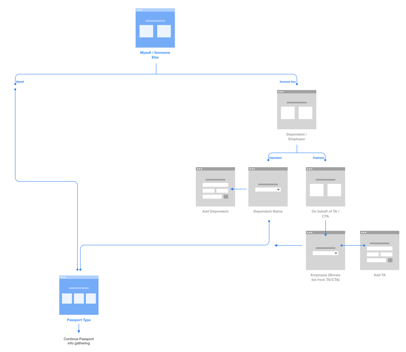
A sample of the user workflow for a user get to the correct forms/applications.
Phase Two
Application design · 12 months & beyond
Key Design Solutions:
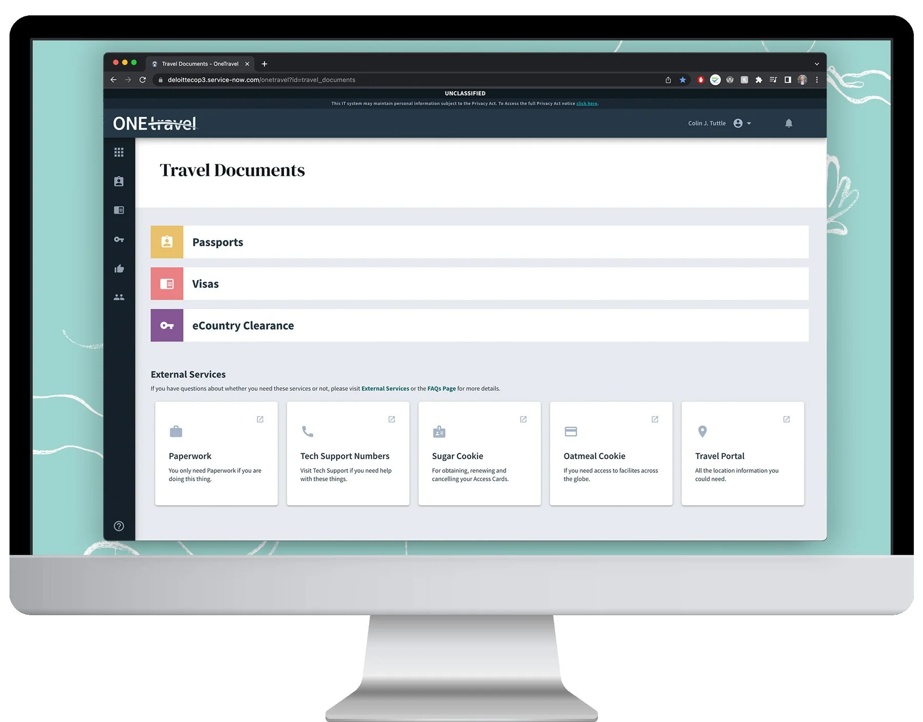
- A Dashboard to access documents and passport application with a permissions based UI, respectively tailored to each end user
- The Passport Application to end all Passport Applications conveyed in a design tree experience, mitigating risk of incorrect processing
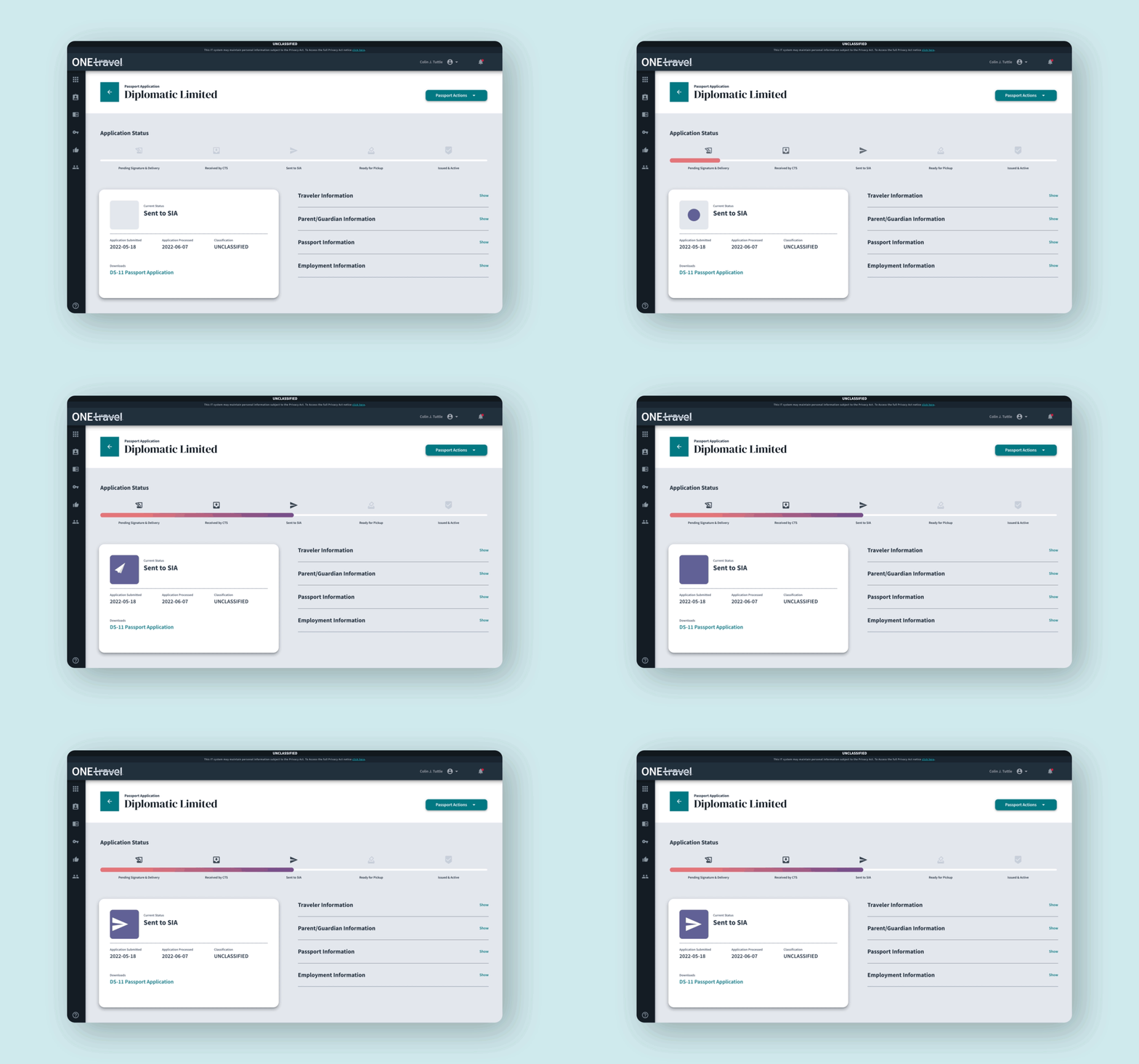
- A visual way to track an application's status
Ideating for the future
We designed for a future state, knowing that this applications first release would only be about 10% of the planned final solution.

Main dashboard for Travelers. We utilized Material UI for majority of the iconography.

Animations were JSON/Lottie files that we created. This kept the file size down without compromising the experience. They served the purpose of helping inform the user, while sparking joy. Waiting for travel documents can be a tense time, with low patience levels. Having even just the smallest bit of enjoyment watching a paper airplane fly can diffuse that.
Usability testing
1 week, 18 users, 5 modules, 25 scenarios, 270 data points, and not one recording device.
To read about how this went down, see OneTravel Usability Testing
Surprise and Delight
I'm a firm believer that my primary job is to make an application that works well for as many users as possible. If I can make someones day with a micro-interaction, animation, illustration or a well-placed pun, that's what makes me love my job. The icons below were used for the sidebar navigation. We also integrated animation into the pizza tracker to help diffuse an otherwise impatient traveler.
Phase Three
Application deployment & refinement
This project was a rough launch plagued with broken code, missing features that we had never discovered and a slow process to fix all that. After a few months of putting out fires we were able to reestablish a normal production pipeline and work on fixing the processes for the next releases.
Measuring the impact of design
Prior to deployment, an independent team did stopwatch timing exercises with users on original workflows to execute tasks as baseline metrics and identifying areas to automate and simplify. We then applied the usability tasks to the updated design with fruitful outcomes.
The time to renew a passport was reduced to an average of 4 minutes.
We reduced the time it took for a TDO to complete a passport renewal application from 10:37 min to 6:02 min! That saved our TDO's four minutes on average per application. That's a 43.17% time reduction.
Submitting an eCC for a traveler was reduced to an average of 13 minutes.
We reduced the time it took for a TDO to complete an eCC for a traveler from 24:47 min to 10:37 min! That saved our TDO's 13 minutes on average per application. That's a 57.16% time reduction.
57.16% reduction
in task time for eCC form completion, saving 13 mins on average
43.17% reduction
in task time for passport form completion, saving 4 mins on average
Award-winning
the program was awarded an accessibility award with a 4.5/5 accessibility score
Handoff & Reflection
5 low side developers, a dozen stakeholders, 2 high side developers, 1 on-site project manager, 2 career coaches and 24 months to execute later….
This project was the longest in my career and the most fulfilling and it continues to be refined, tested and iterated since my departure.
I had the privilege to flex not only my design and research skills, but also managerial and project management practices. Leading daily scrums, pitching phases and concepts to stakeholders, writing stories, tickets, getting dirty in the front end code was just the tip of the iceberg.
Artifacts + Deliverables:
- Branding Guide and Components Kit
- Sketch files with Design System, 400+ screens published to Invision
- 270 Data Point Research Findings
- Accessibility, Requirements Gathering and GoLive Decks and training materials