OneTravel Usability Testing
OneTravel was finally pushed to the highside environment and a test instance was set up.
We needed to validate workflows and determine what needed rework and we needed it very quickly.
Hurry up
Usability testing needed to happen immediately as the winter holiday break was coming up. Our test subjects were about to check out for a few weeks, our launch date was getting pushed earlier and earlier, and we had no UX researcher.
Bootstrapped
We set up individual user testing to be run on site, with the Traveler persona. As this is a classified environment, all testing had to be recorded with scrubbed information, or using low-tech methods.
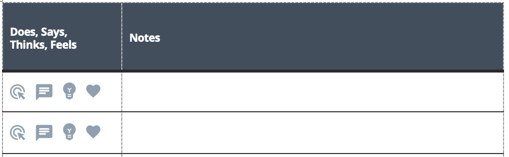
Setting up templates
The initial step involved designing templates for effective note-taking. I created intake forms that captured essential user information, including baseline quantitative metrics on their job and the current system. Additionally, a simple note-taking sheet was designed, incorporating icons to swiftly document the tester's actions - thoughts, feelings, words spoken, and actions taken.

Designing Testing Modules
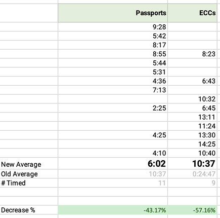
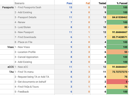
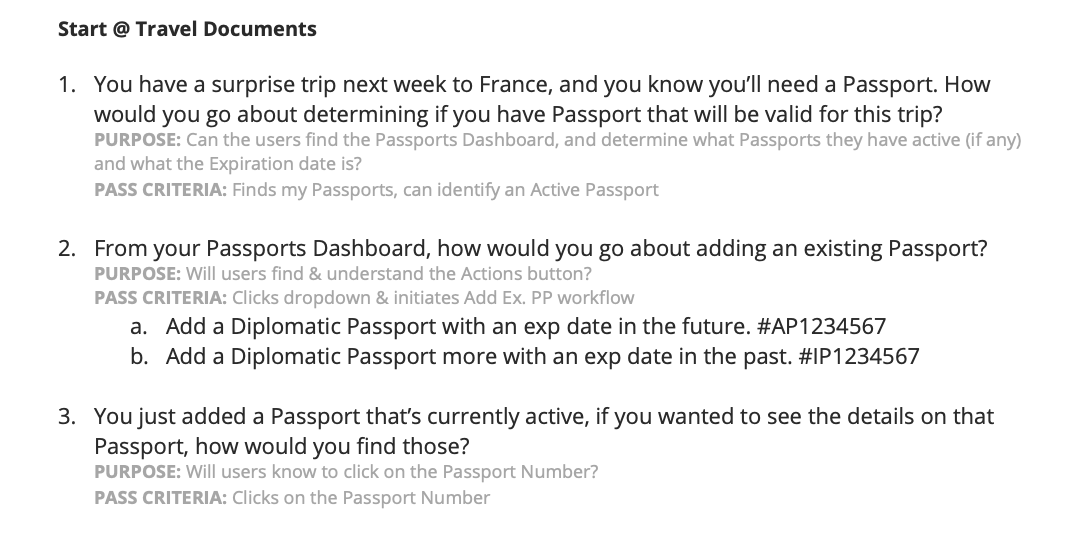
Our application revolves around three core travel documents - Passports, Visas, and eCCs. Thus, the testing modules were constructed starting from these three key areas, and incorporating additional specialized workflows. In the end, we had three modules encompassing five major features, featuring a total of 18 scenarios. Each scenario was equipped with clear pass/fail criteria and a purpose statement, providing context and rationale for the internal team. During the testing phase, we also performed stopwatch timing on two critical workflows to obtain early performance metrics.
Conducting Participant Screening
An initial email was sent to over 240 individuals who had expressed interest in participating in the testing, with the aim of screening out those with a design or development background, prior experience in usability testing, or any role in document processing. This reduced the list of potential participants to 70+, of which 19 had availability during the required time frame.
Running Tests
Each user was tested in a one-on-one basis with one facilitator and sometimes an additional notetaker or observer. Each participant was given the same script (minus small tweaks for clarity) and given a testing module at random. Each module took ~40 minutes to complete, so the majority of users completed one, but tech-saavy users completed two. One test was cut short due to the subject becoming aggressive and uncooperative. Their data was recorded but discarded.
Organizing Results
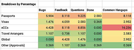
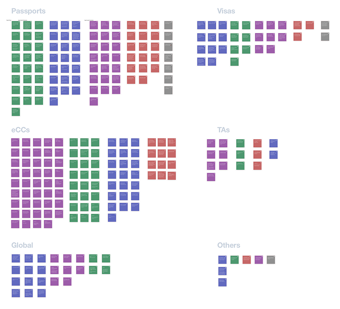
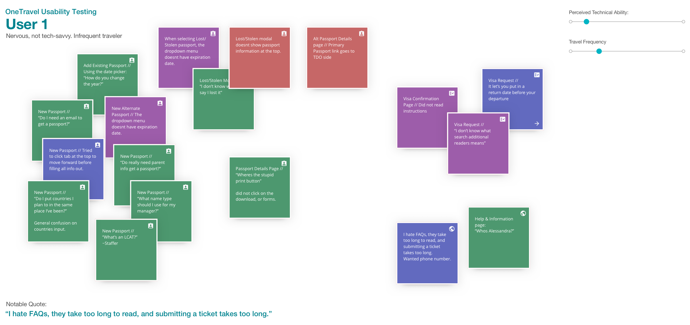
Any action (thinking, feeling, saying, doing) was recorded on the notes sheet and later transferred to a Sketch file to create an affinity map of the aggregated data. The feedback was recorded in one of five categories that emerged: 🟣 Common Hangups, 🟢 Questions, 🔴 Bugs, 🔵 Feedback & ⚪️ OBE (irrelevant issues due to ongoing work). These data points were then organized by testing module & data type to create the final affinity map. The affinity map was then turned into a heat-map in excel to identify priorities

All the datas
Metrics
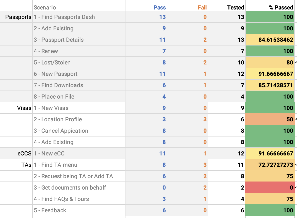
The testing resulted in over 270 data points being recorded and organized, and one candidate for A/B testing identified (. Due to time constraints of the release schedule, we rolled the A/B test into my usability testing to help fix a major issue. The data points were organized in an excel document to show pass/fail rates of each scenario, timing exercise results/changes. I don't often nerd out in excel, but when I do, I go hard.


A/B Test
In one of the testing modules, the first scenario was that the user add a travel arranger for themselves. Pass criteria for this scenario was the the user was able to find the link to do that. In the first three tests, all users were unable to find that menu and failed the scenario. I had a hunch this would be an issue, but zero percent pass rate was disheartening. I talked with the team and we decided to make a small change to the interface and continue testing. We removed the link from the user menu, and created a link in the main sidebar. After the change, the remaining eight tests were passed.
Next Steps
I organized all this information into a simple word document for the client outlining successes and themes showing areas of focus moving forward. We broke down the modules to show AOI within them and each of these areas of focus was turned into JIRA stories before presentation. The team then spent the next few months squashing bugs and working on usability fixes pre-launch.
Metrics
57.16% reduction
in task time for eCC form completion, saving 13 mins on average
43.17% reduction
in task time for passport form completion, saving 4 mins on average
Award-winning
the program was awarded an accessibility award with a 4.5/5 accessibility score