A complete blunder down-under
Tourism Australia approached Travel Leaders about a Highly Targeted Campaign featuring several select suppliers packages.
Agency: Travel Leaders Network | Client: Tourism Australia | Contribution: Lead Designer | Year: 2017
What the heck’s an HTC?
Travel Leaders has a giant database of travelers, with all their info. They make most of their money using this data to sell more trips on behalf of companies like Royal Caribbean, Universal and Tourism Australia. These highly-targeted campaigns make it look as if you are speaking directly to the reader.
Think: A junk mailer comes that says something lame like “Well hey there (insert your name here), are you ready for a radical cruise with RCI?!?!”. You cringe, I cringe, it goes in the recycling bin.
Tourism Australia gave us a tiny budget to run one of these as a test piece. Little did we know, this was running in conjunction with a very large and very secretive social campaign.
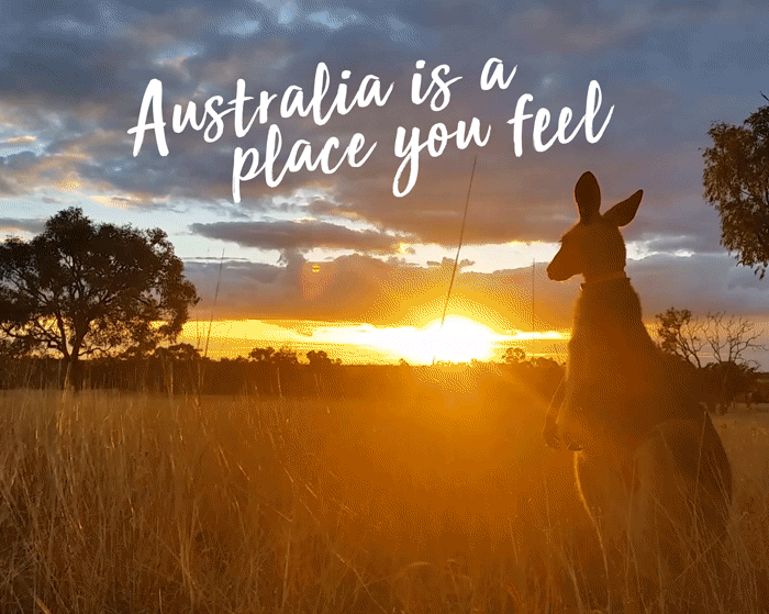
Who doesn’t love a postcard
The campaign highlighted the five pillars of authentic Australia: WILDLIFE, CUISINE, CITIES, OCEAN and LANDSCAPE. For each pillar, I assigned a color scheme based off the TA logo colors. This color theme ran throughout the whole campaign and helped distinguish each section of the site, mailer or email.
On the scale of Highly-Targeted Campaigns, this one had a very small budget. As a new designer at Travel Leaders, the creative director let me off the leash to test me on this “small” project.

Deliverables
The website was highly visual, relying on large beautiful images and videos to show just how gorgeous Australia is. The goal was to get users excited about many of the lesser-known activities and locations, then drove them to contact one of our travel agents. No opera house or great barrier reef photos here.
The print campaign, comprised of 4 mailers, also featured large beautiful images, but to make them stand out from all the other junk mail we sent, we came up with unique styles. These included envelopes holding post cards, a fold out map, and two mini advertorial magazines.
The email campaign was similar, but used large gifs with very subtle movement. The minimal movement saved us a ton of file size on the images, but gave the otherwise static emails a breath of life.

I was so dang proud of myself for getting this header to work in Wordpress.

result
QUICK! Picture something from Australia! It was the Sydney Opera House wasn’t it? Guess what? There are hardly any images of the Opera House that aren’t Editorial Use Only. My work around was to use video instead. File sizes ran a bit higher, but I’m pretty great at compressing video for web.
This was my first large-scale campaign that spanned web, print and email, so saying I learned a lot is understatement. The largest learning was in the email campaign, where we had abysmal click through rates in the first email. With each email we revised and iterated, driving more contact with the travel agents.
The biggest failure of this campaign was that the client could not, and did not tell us that they were in the middle of a viral marketing campaign that was set to have a big reveal at nearly the same time we launched our campaign. You may recall the trailers for the Crocodile Dundee reboot? Yeahhhh. We got sandbagged pretty hard. Our campaign got steamrolled, then once the big reveal was over, quickly pivoted to match the main campaign. This splintered our message and created a highly inconsistent feeling from one touchpoint to the next.