Overview
Ok, so what's next?
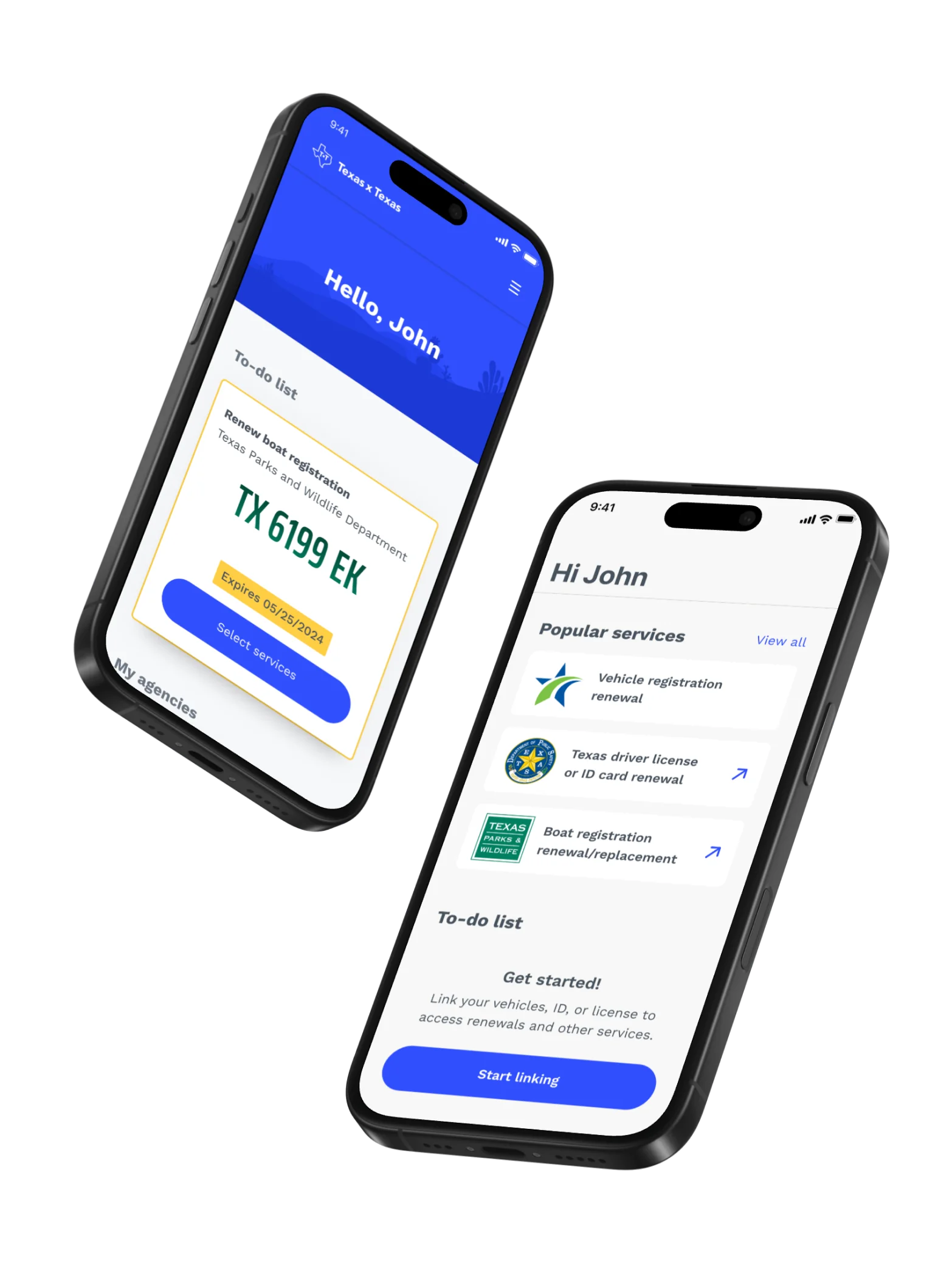
TxT has been a growing and evolving application for years now as the place to get and renew a driver license in the State of Texas, but there had been minimal integrations since the initial launch. Texas Parks and Wildlife Department was interested in adding boating ID cards and registration to expand on TxT offerings.
The details
The core TxT Product team was wrapped up with other work, so I was pulled in for a short integration project. I got one designer, one content writer, and a total of 6 weeks to complete all the work. The TxT Product team had carved out very detailed operating procedures and techniques. We threw almost everyone of them out the window to get this work done on time.
The TxT application is a web-app and apple/android native applications. All three integrations needed to be created in this 6-week period.
Setting the stage well
My boss put me on this work because the budget was tiny and they knew I could get shit done quickly. For my team, I set this expectation early and often. There was a well established design system and processes to accelerate the work, but still a lot of work to be done.
In design kick-off I made it clear our objective was to get the defined work done and roll off on time. Anything risking our timeline was to be surfaced immediately and I could help resolve. These objectives were also circulated to other teams and leadership so we had buy in across the board.
Design
What do we already have?
The benefit of working within this application was that the design system and patterns had been defined well and tested. For the most part, this project was about finding the square peg to drop into the square hole.
What do we need to make?
Sometimes we came across a circle peg and we needed to change things up. These features required new patterns or components and caused a bit more stress among the team. No one likes being told we need do more work, but at the end of the day, the users and requirements were unique, so it was needed. I'll focus on these two features that took extra effort.
@2x.jpg)
.jpg)
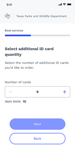
Feature #1
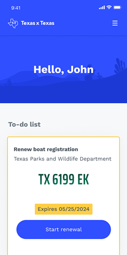
To-do list cards
Not the most exciting or revolutionary, but important to this project. The application deals with driver licenses, massage therapy licenses and we needed to integrate boats. This meant distinguishing factors so users knew if they're clicking into a boat or car to renew.
The TxT team had made a cute license plate to show cars, so I looked into boat registration number decals. Boat owners get very into these decals and often include photoshop-like effects. After some tests in a codepen with multiple drop-shadows to create a faux-3d effect, I decided to take it down from 11 and give it a subtle gradient that nodded to the Parks Departments green branding. It still used the same typeface as vehicles, so there was consistency, but stood out.
Feature #2
Service selection flow
aka Whatchuwannado?
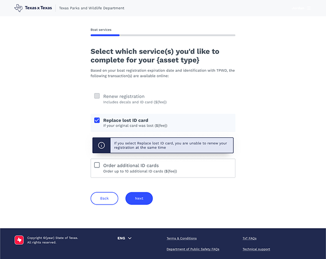
The most complicated feature was when users had a boat in the system and they needed to take action. They only had three options…how hard can that be?
Depending on which option you choose, others can be disabled or are included automatically. While not wildly difficult to design, getting others on board was an interesting process. These selection cards were based off existing components to lessen development efforts, but augmented to fit our use case better.
Pass #1
The first design I came up with (not the best) included both radio selections for the either-or options and a check box for the optional item. While technically correct use of the components, it ended up being a weird interaction and mixture.
+(Replace+ID+Selected)-1.jpg)
Pass #2
To make the experience feel more consistent, I shifted all the options to check boxes. Each option had sub-text to give context to users. While this was a better fit, the technical lead could not get his head around why some options were becoming disabled and pricing was changing. I swallowed my pride ate some humble pie and took another crack at it.
.jpg)
Pass #3
Rather than sub-text, I opted to have inline alert messages giving users feedback on what was happening, while a bit overkill, this did allow for more varied feedback in terms of visual solutions.
I showed this to the technical team and again the tech lead pushed back. I took all my options and pulled in the TxT Product UX lead to weigh in. She, in her infinite wisdom, agreed my solution was the best path forward and my ego grew 5% more than anyone needed.
+(Renew+reg+Selected).jpg)
Is that it?
There was a lot more design that was completed, but it was a lot of plug-and-play from the existing design system, or was completed by other designers. I ain't about claiming credit for other peoples work so we'll just skip over that.
Outcome
That's a wrap!
I'm happy to say that we finished our section of work on time and on budget. The team cut down to trickle-support as the development continues. The integration went live in 2025. If you need a boat license or decals in Texas, give it a whirl and let me know what you think!