TDCJ eComm Direct
Texas state-run jails allow you purchase goods from the commissary for your loved ones.
DAMN DAMN AND DOUBLE DAMN!!!
Just look at all that text. It goes on like that for a while…
Overview
If you're wondering what I would use as a behavioral interview question about my process, this is it.
Texas Department of Criminal Justice runs commissaries within the state facilites so inmates are able to purchase everyday items like snacks, toiletries and clothing while incarcerated. While incarcerated individuals can have the ability to work and earn money to buy those things, most rely on loved ones to deposit money in their accounts and buy them what they need.
People did not love it
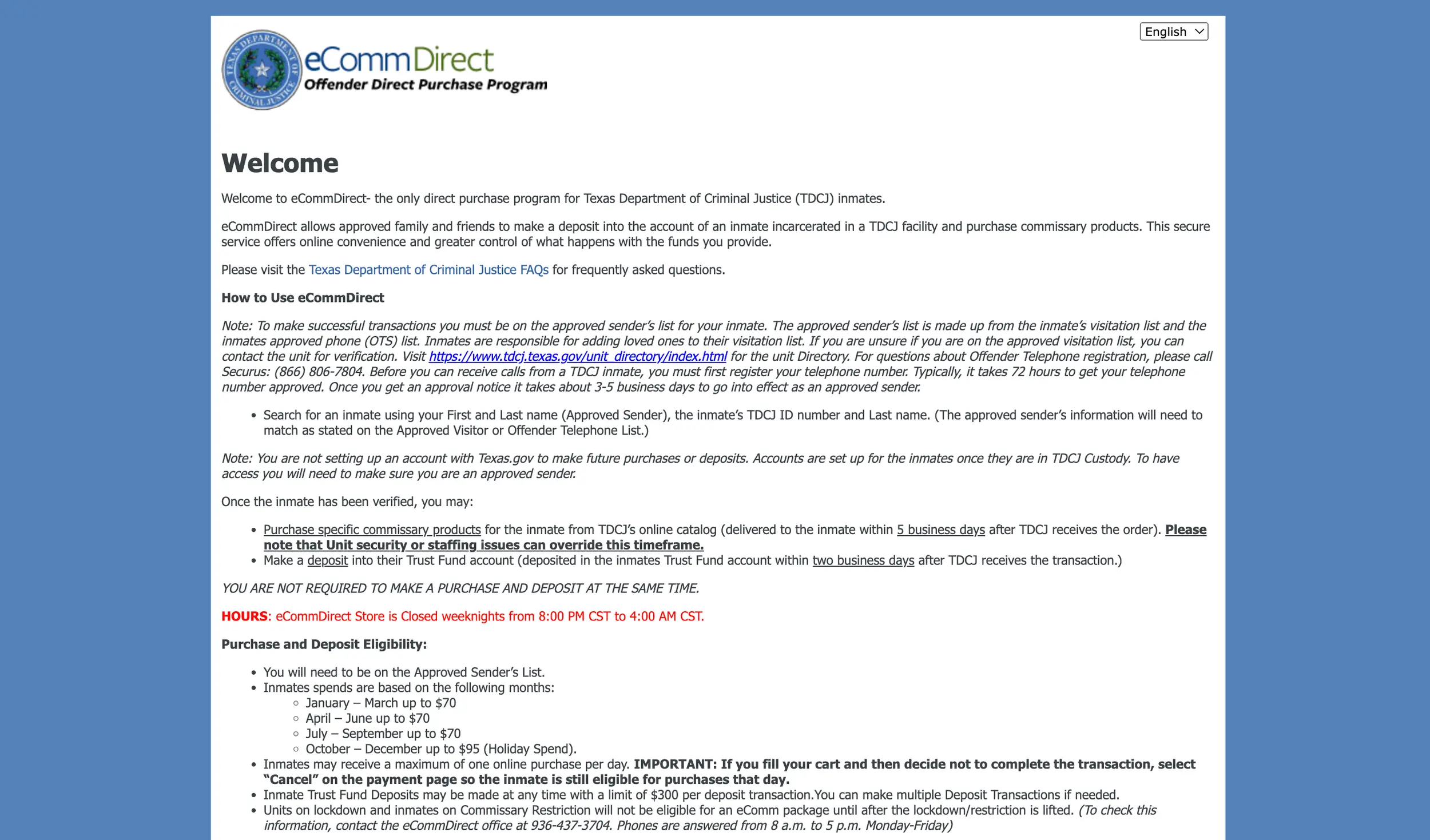
First created in 2011, the legacy solution was not exceptional on many fronts. The interface was mostly text and links, nothing was intuitive and it did not function consistently.
The scope is what now?
It could have been worse…When I was brought on to lead the design team, we were told the scope for us was "UX and visual enhancements, but no new functionality". I'm still trying to figure out who said that was okay, but it opened the door for us.
User Types
Incarcerated Individuals
While the inmates don't interact with the system, it is built around their rights.
Approved Senders
Loved ones of inmates are able to send money or buy products for those in a facility.
Admins
TDCJ employees keeping the store up to date with products. This post won't show this application.
There's no 'i' in team, right?
With one UI, one UX and two content designers, this was to be my biggest team to lead to date. With four months to design from scratch, we had our work cut out for us.
My boss let me build this team, so I had the option to work half time and bring on a senior team, or work full time and bring on more junior designers. I opted for the later so I could help grow their design skills and my leadership skills.
One of the decisions I made early on, was to take administrative tasks on myself so they could focus on creating amazing work. Writing stories, updating sprint boards would all fall to me…what could go wrong?
Setting the tone
I was pleasantly surprised with the amount of discovery we were able to do in this project.
Typically, government clients want the work fast and cheap. Discovery isn't viewed as necessary because they know why they want their site updated. A large portion of my job is education about this kind of thing.
This time, we were lucky enough to get ahold of metrics, survey results and be able to do some SME interviews in the first sprint. The UX designer dove into this while the UI designer started a heuristic evaluation of the site. At the same time, the content team started a content evaluation and building out content guidelines to drive all copy to be written.
Define
If I've said it once, I've said it a thousand times…half my job is education. This client was fantastic, so open to the design process, very excited about the changes we had planned. The one thing that needed a nudge, was helping them see the work we should do was more than the few things they knew they wanted to fix.
From the survey responses we were able to pull quantitative metrics to provide us a baseline for future testing and and qualitative remarks to help provide north star direction for us.
Key findings:
- ~75% of users were on a mobile device
- Survey results were affinity mapped to show a desire for more features, fixing old issues and better communication with users (mostly bad direction in content)
Speaking of which…the content completed their guidelines with three pillars to drive copy: direct, reliable & friendly.
Knowing that having a loved one in prison and trying to communicate is a difficult time, we wanted to ensure we were focused on educating and designing with a empathy-first approach. To help the team align we came up with a product vision to "Create an empathic journey for customers trying to buy/deposit money for loved ones in prison."
Design
First Steps
As this was a modernization, we were able to quickly jump into designs after gathering requirements.
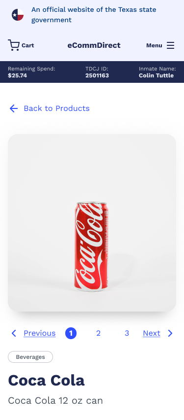
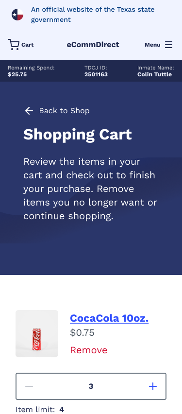
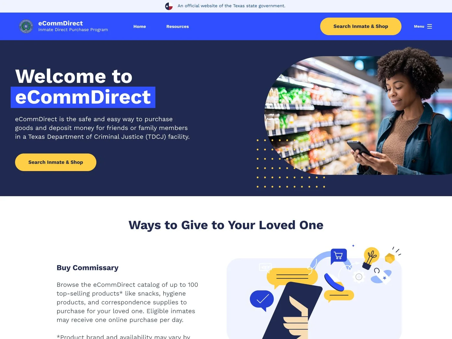
The whole team was running agile, so while the UX team started lofi comps, the UI team dove into defining the visual look of the site. We were tying this site into the main Texas.gov design system, so we had a good starting point, and needed to theme the system to make it unique. Beyond the base buttons, inputs and styles, we experimented with imagery, page blocking, and more ecomm specific elements like product cards.
Time to run
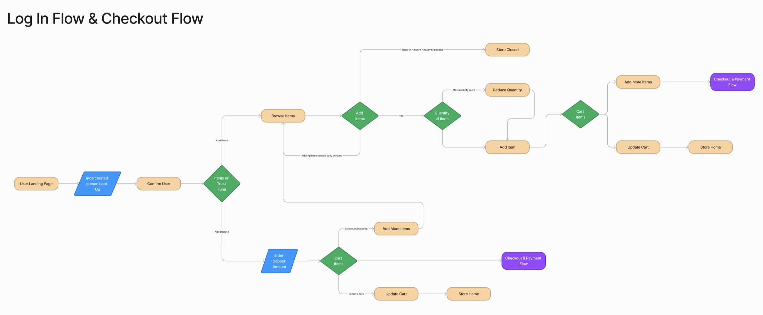
Knowing we were short on time, the design team worked agile to hand the first wireframes off to the UI team. Myself and a junior designer had a good idea of the visual direction we wanted to take and were ready to jump into real comps.
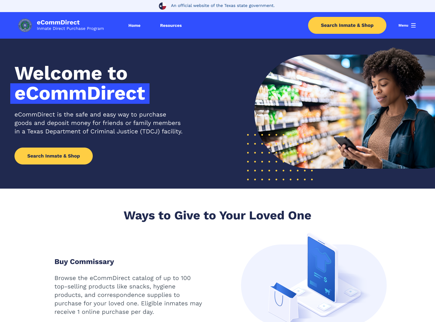
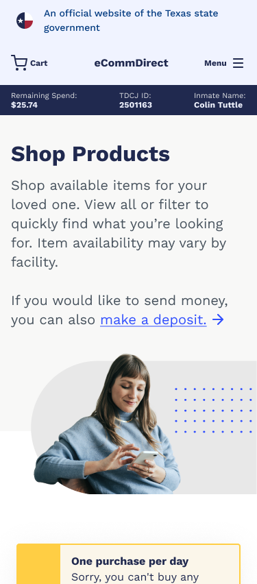
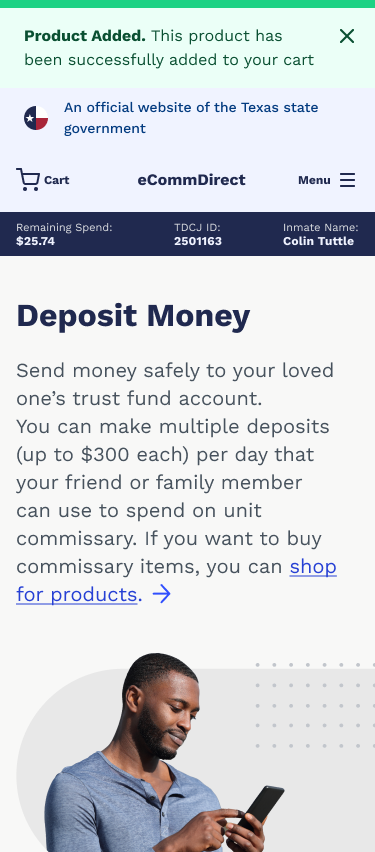
Leaning into our friendly and empathy-first approach to content, we wanted to showcase imagery of people to ground the main pages, and sprinkle in humanist illustrations to help our users connect with some of the more complicated restrictions. When we presented to the client, they were thrilled with the direction and had almost no notes (WhAt CoUlD gO wRoNg!?!).
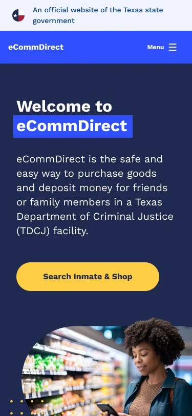
Knowing roughly 70% of our users were on mobile devices, we focused heavily on a everything-friendly approach. Side-note: I avoid mobile-first for web apps because its still prioritizing one screen size over another. We're pretty awesome at our jobs and capable of coming up with designs that will work just as well on mobile and desktop.
Moments of delight
Since we were a bit ahead in the schedule, I spent some time adding subtle animations to our illustrations. We knew this was a stressful time for approved senders, so a cute animation could help bring a smile to their faces.
Typically I animate with After Effects, then export to Lottie animations. This allows for super low weight files, but also requires setting up a few libraries. I decided to just stick with simple and subtle animation so gifs worked fine and required less work from the dev team.
Charging forward
With the hardest part behind us, the design team was able to start cranking out screens.
This was the point I really got to know my teams skills and limitations. I'll keep this post about the work, but lots of learning was had by everyone on the team. I worked really hard to get amazing work out of the team, while making it a safe place to learn and grow. If you're curious about this process, just ask!
Testing
HMW: Run a project so I can answer the process question in an interview?
Knowing that my UX designer wanted to get more practice with her interview skills, I created a few intense sprints that freed us up to run usability testing on the screens created.
The only problem was, when we got into what exactly that entailed with the client, they got cold feet. After many meetings and talking folks down from a ledge, we found out their concerns were that someone would leak the existence of the project to the general public and cause a tidal wave of calls asking when it would release (an actual thing that happened to them on another project).
Being wildly creative (stubborn), I decided that we would whitelabel the comps and test only on users outside Texas. Because we used a well built design system, it was easy to change branding. With that, we got the okay to run testing.
As an added precaution, we had legal draft an NDA, we password protected the file and changed it for every participant, then finally, targeted people outside Texas.

Look at that awesome logo! Colin Tuttle: King of the 30 second logos.
Testing by the numbers
Participants:
Two internal TDCJ employees that directly interface with our primary users on a daily basis.
Seven participants from states that have online commissaries, and have been or had a loved one in jail at some point.
Tools:
Userinterviews.com to source and schedule users.
Zoom to run and record the meetings.
Figma high-fidelity prototypes for testing and Figjam for recording our notes.
Tests:
Six introduction questions to determine the users familiarity of the processes.
Nine short'ish scenarios for each participant to work through.
Two general post-scenario qualitative questions to gauge high level thoughts and pain points.
Five quantitive questions to identify trends in usability in the new designs.
"…the site gives you a comforting feeling bc it's not b&w and stale.. feels like whoever developed this thing cares about inmates and that's a sense you absolutely do not get from other websites"
Presenting an ethical outcome
Our quantitive questions were created to mimic questions being asked on the current website. We changed them to be a less leading, and more neutral question, as this would get us better data, but also didn't match the legacy data one-to-one.
This slight difference in questions meant we were ethically unable to say "our designs tested X% better". As a team we spent a lot of time deciding what we were comfortable saying, and where we could draw conclusions. We ended up being as transparent about this as possible, and telling the client "this should be considered a new baseline, but we are seeing very positive trends in responses."
thank u, next
From the testing, we were able to find our main themes, requested features and prioritize into design changes for the following sprint.
This allowed the design team to go into our final sprint on target to complete all our work on time. It was at this point the client mentioned they were going to show designs to their leadership…
Iteration
OH GOD EVERYTHING IS OFF THE RAILS
Just kidding…the leadership liked most things except our choice of illustrations, which they felt were too 'cartoonish'.
We came back to them with the data showing that people liked how friendly the designs were. at the end of the day, leadership had spoken and we were unable to convince them otherwise. To ensure leadership was excited about the new direction, we gave them three options to choose from: Similar corporate Memphis style illustrations, with less decorative elements, and one isometric illustration.
I wasn't thrilled with the outcome, but the style looked good in the designs and hit the mark with the client.
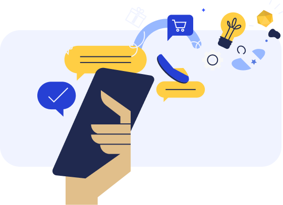
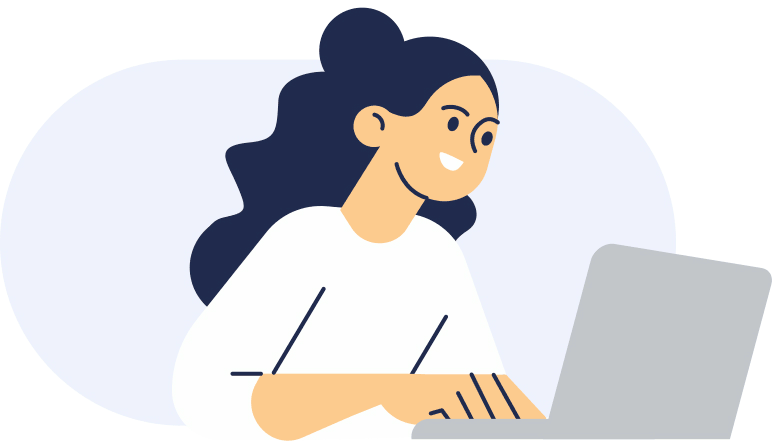
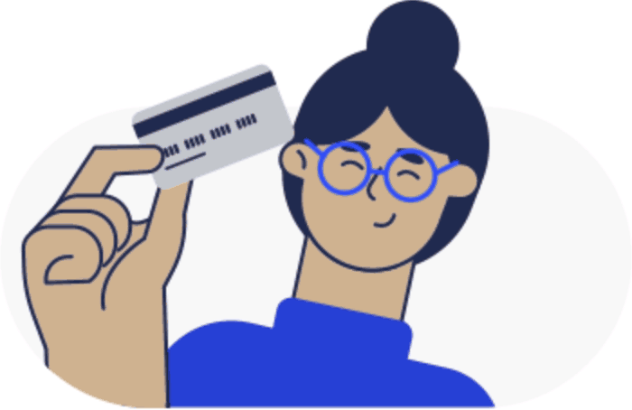
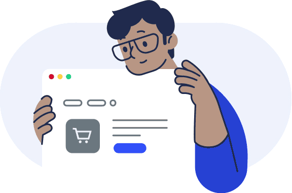
Original illustrations
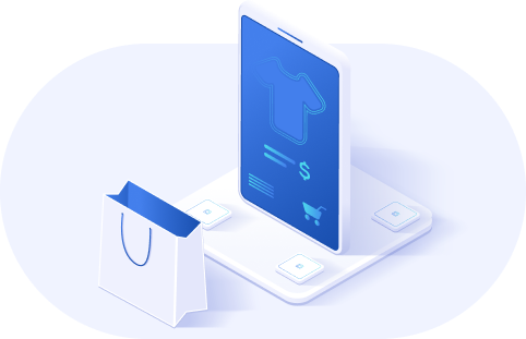
New illustrations
Outcomes
The product released in June '24, to great feedback from the state team and this particular facebook thread…I swear I didn't pay some of those folks to write those nice things. The goal was for this product to make peoples lives easier during times of stress, and that makes me so damn proud to say we achieved that. Visit the eComm Direct site.
Metrics
The state does not typically disclose project metrics after we roll off. They use those to determine if they rehire us or not. Some bits are public record though. In it's first year of operation, the site saw:
1,682,779 deposits
to inmate trust fund accounts totaling $131m
482,660
online orders totaling $19m
Bonus
A good captain always goes down with the ship…I mean, provides trickle support after the design phase.
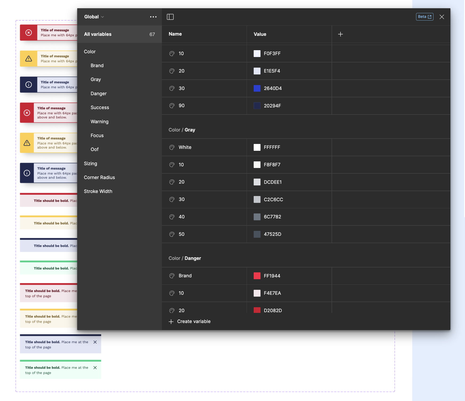
The rest of my team was off to other projects, but I remained on-call for any design support the development team needed. During this down time, I spent time getting more comfortable with Figma's variables. Looking at how the Microsoft Fluent team built primitives and semantics gave a great foundation for what I needed, and I converted the design system over from styles.